While charts and graphs are great visual representations for companies to provide a clear picture of in-depth analytics, sometimes you just want to know if goals are up to snuff. That’s where a dial chart, also known as a gauge chart, is looking to make sure that there’s as clear an understanding as possible about standing. This is letting organizations not only save time on having to comb through a dataset for exact info but also know where things currently rest and decide on the next step.
Table of Contents
What’s a dial chart?
Sometimes, less is more when it comes to visuals. Dial charts basically take on the look of a speedometer on your car’s dashboard, showing one measure of performance against a goal. This usually comes in the form of a semicircle that is colored to represent milestones and a dial that points to the end result. Gauge charts are an excellent visual that makes it easy to communicate a particular item of information in a clear way. A score can be plotted with a needle along this scale, usually going from calmer colors like blue and green to red and orange to indicate a problem.
A dial chart is often used in business intelligence visualizations. These charts communicate the facts clear as day, even to someone who’s not an analyst. Oftentimes, you’ll see something similar to a gauge on business dashboards, as a reminder of continuing key performance indicators. Gauge charts only measure one thing and present this information to be simplified. Values are easily differentiated using color-coding, which is immediately interpreted.
When should a gauge chart be used?
A dial chart is simple but has a strong set of criteria to be used. First and foremost, you can only measure one thing and that measurement must start at zero unless there’s a pressing reason not to. This scale must also be linear, showing a single percentage of achievement between zero and an upper limit. In a business setting, a gauge chart could start at $0 and finish at $1 million to demonstrate annual sales. The scale can be divided into color-coded thirds, citing color change at those plateaus to indicate valuation within that given timeframe.
Dials can include anything with a goal or target, including work that has been completed against a total volume of tasks, or monthly sales completed compared to the monthly goal. This can be very helpful for those within an organization who oversee finances, particularly when measuring profit to budget. In project management, companies are able to define deadlines and modules. In economics and finance, a clearly labeled gauge can show researched details and statistics, and even the performance of a team against measurable KPIs.
Could I use a dial chart alongside other graphs?
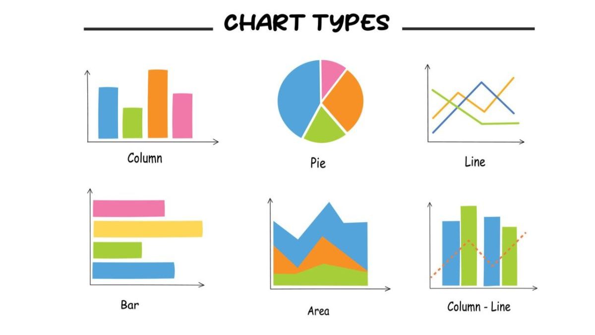
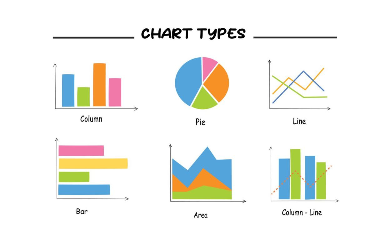
While gauge charts are easily understood and of a high value to get facts across with immediacy, they are best teamed up with other charts that show off more detailed information. There are traditional bar and column graphs that can articulate more about the function field being demonstrated as a dial. This is especially the best case for multiple measures based on the necessary data points to have analytics properly function.
Doughnut charts and pie graphs are also commonly used along with gauge charts to demonstrate the percentage values as they relate to business goals. They are related to non-quantitative data and how a whole can be divided up into individual parts. In an advanced gauge chart, more than one needle can be plotted onto a single gauge. This is ideal where there is a single item being measured but a number of categories. It’s important no matter what to make sure visuals are clear, especially when presented to key decision-makers within an organization.